top of page
our work.
Since 2020, we have been connecting the deeper value our clients offer to what actually matters to their audiences across the following industries, both locally and internationally:
Construction Law • Luxury Hospitality • Tax & Auditing • Wealth Advisory • AI Software • Travel & Tourism • Events MICE • Automotive Retail • Financial Services • Luxury Real Estate • Hair Wellness & Beauty • Software Development • Online Education • Photography • Digital Publishing • Personal Coaching • Property Development • NPO & Charity
Our branding brings all the boys to the yard.
Viva!
Explore a sampling of select clients who have checked in at The Pen Haus over the years, many booking multiple stays with us:


brand strategy.
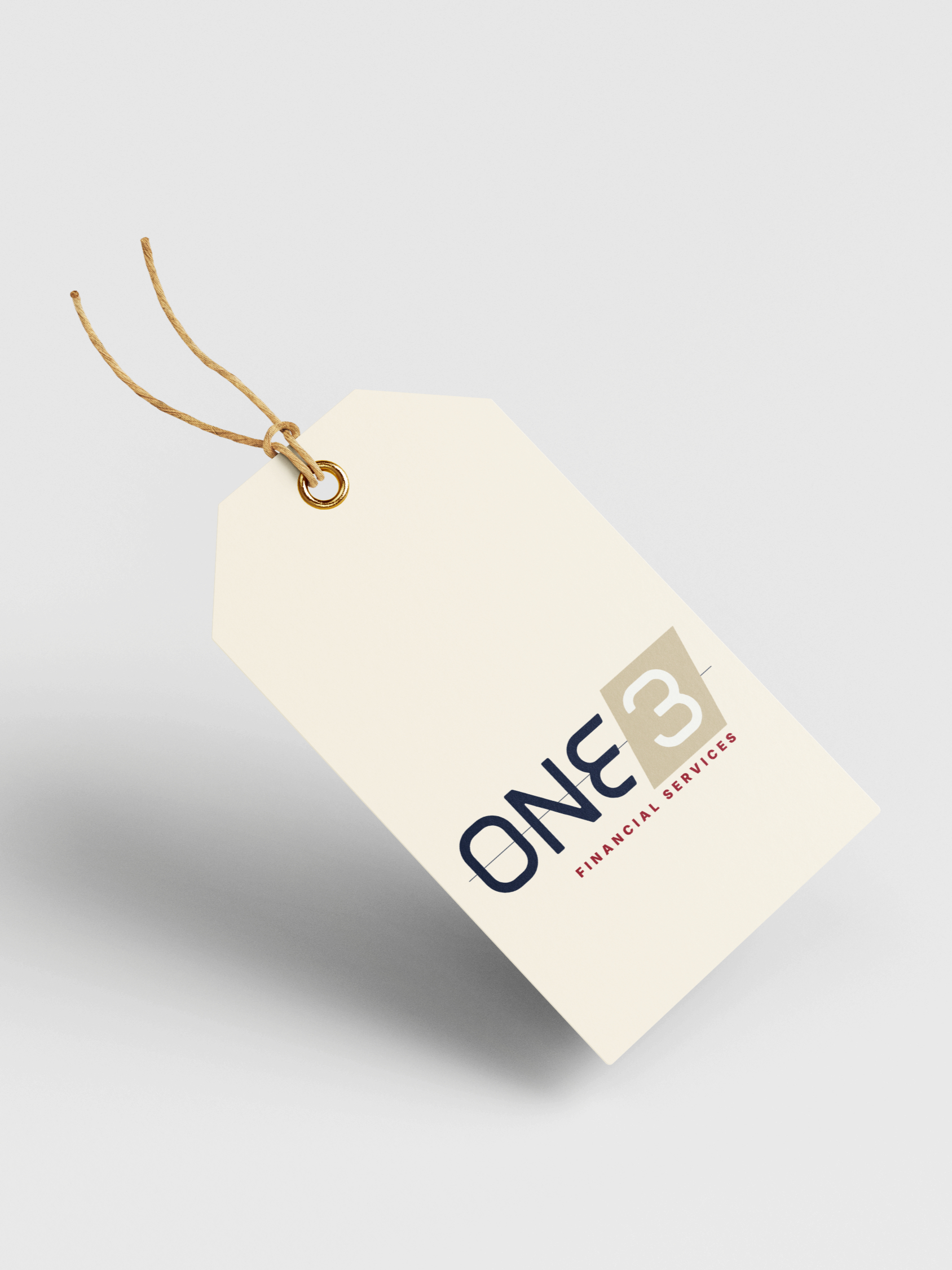
ONE3 Financial Services
Finance & Insurance Sector • 2026
The challenge.
Following a major internal transition, ONE3 needed a distinct new brand without losing the reputation and trust already established over decades
Our thinking.
We built the logo and brand around grounded continuity: the idea that ONE3 quietly handles every moving administrative part so SME leaders get to focus on what they need to do most: sleep, trade, employ, grow, protect, and plan
The result.
By connecting what actually matters to their audience to the deeper value of what ONE3 offers – grounded continuity – we expressed that relationship through the brand's look, feel, and voice

[click item to enlarge]
creative direction.
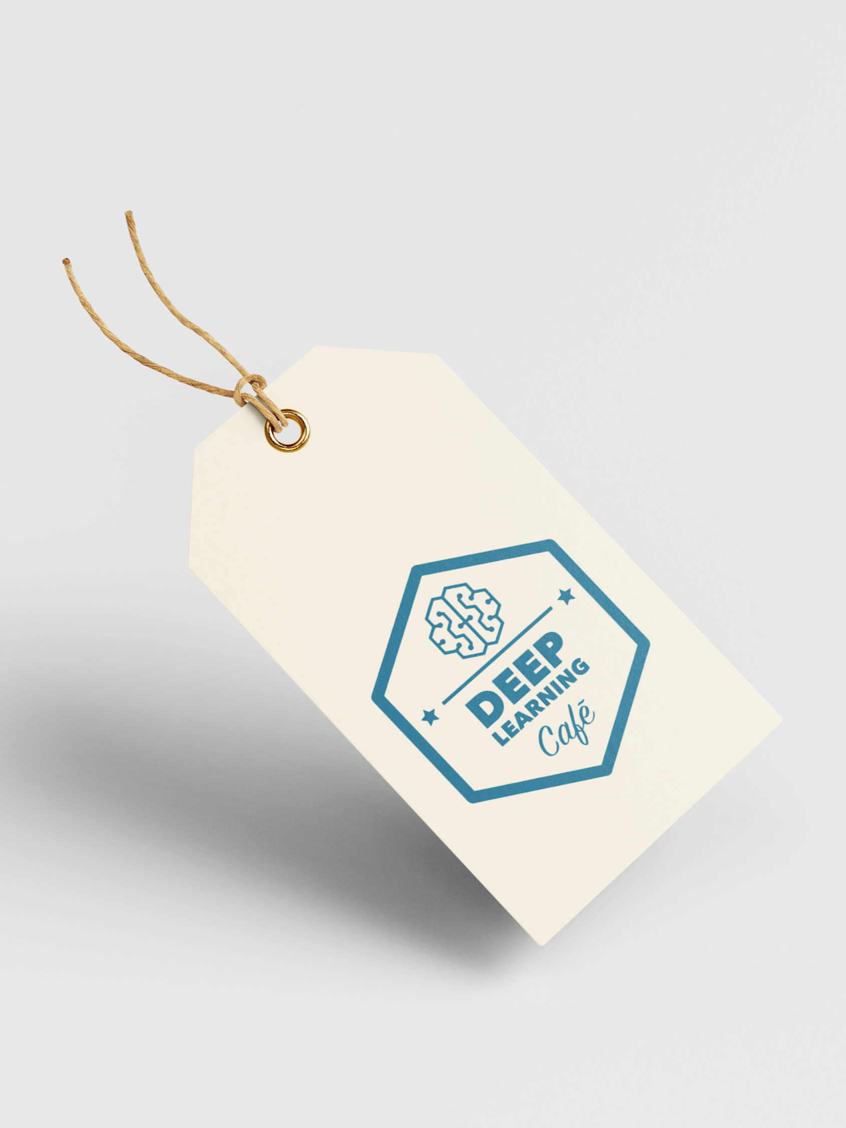
Deep Learning Café
AI Software Development Sector • 2022
The challenge.
Back in 2022, before AI became mainstream, Deep Learning Café needed to make their complex offering feel approachable, relevant, and accessible to SMEs and the world at large
Our thinking.
We brought the café concept in its name to life, using the warmth and familiarity of a local diner to guide the photoshoot, visual storytelling, and website experience around a whimsical, approachable introduction to business AI solutions
The result.
A welcoming digital world where imagery, language, and design dovetail to make intimidating technology clear and understandable to the audience it's meant to serve

conceptual copywriting.
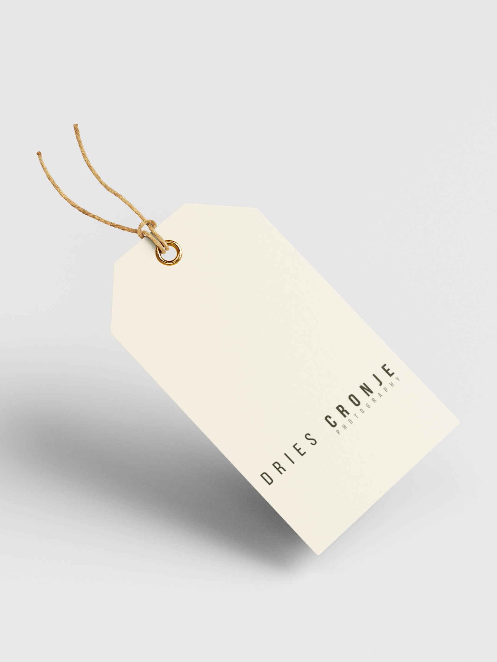
Dries Cronje Photography
Visual Arts & Media Sector • 2025
The challenge.
Award-winning photographer Dries Cronje needed emotive language to articulate his intricate philosophy, depth of his images, and the artistic vision of his work
Our thinking.
Through our signature excavation and discovery process, we explored Dries' inner world and uncovered five tensions present within each of his images—light, silence, witness, time, and honesty— giving language to his instinctive way of seeing
The result.
Through conceptual language, we created a tangible connection between audience and image, inviting people to experience the stories that live within Dries' art

brand identity.
Adine Abro Attorneys
Specialist Construction Law • 2025
The challenge.
Construction attorney Adine Abro needed a refreshed brand identity that honoured her well-established reputation while retaining audience familiarity
Our thinking.
We took the approach of considered restraint, distilling the original AAA identity into its essentials: her name, signature colour red, company slogan, and architectural cues.
The result.
Refined typography, an evolved palette, a subtle nod to the double As in her name, and the concise promise "Constructing Success" brought a more assured, pointed expression
* The wider brand identity is being developed for a future rollout

[before → after]
logo concept.
SigmaSoft
Software Development Sector • 2023
The challenge.
Australian software development firm SigmaSoft needed a new logo with standalone icon that would resonate with a global audience
Our thinking.
By combining two binary-type interlocking forms into a single mark to create the letter S, we echoed the logic of coding and connected systems — a visual expression of the underlying infrastructure SigmaSoft creates for other developers to build upon
The result.
A timeless logo with digitally-inspired typography giving this business with its complex offering a recognisable signature. Adopted in 2023, it continues to represent SigmaSoft today

video lookbook.
The DMC Southern Africa
Luxury Travel & Tourism Sector • 2024
The challenge.
DMC needed to bring several distinctly themed nights to life in one cohesive preview for a Fortune 500 Global client's annual event
Our thinking.
We used video storytelling to weave atmosphere, locations, interiors, and gastronomy into an immersive journey through each evening's unique world
The result.
A series of evocative video lookbooks that showcased the multifaceted aspects of each event, helping the DMC SA communicate their vision in an unforgettable way

[excerpt from full video — 'iv']
explainer video.
MGI Bass Gordon
Tax Auditing & Advisory Sector • 2022
The challenge.
Prominent firm MGI Bass Gordon needed to introduce its collaboration with cloud-based accounting software Xero to its clients and the world at large
Our thinking.
Through our signature discovery and excavation process, we expressed the value relationship of Xero to the clients who would benefit from it. We chose the format of an animated explainer video and through storytelling simplified and showcased those range of benefits
The result.
An easy to follow educational video easily shareable
website.
Palladium Hair & Beauty Company
Hair Beauty Wellness Sector • 2025
The challenge.
Palladium needed to replace an outdated website with a digital experience that honours its thirty-year legacy and expresses its promise of transformation
Our thinking.
Through fresh copywriting, content, and design, we stripped back visual clutter. We preserved the original monochromatic palette and introduced a new brand colour, Palladium Tiffany Blue — history meets future
The result.
An evocative world positioning Palladium as an escape to renewal — a paradigm where clients walk away feeling more at home in their skin

product naming.
Arable Grow
Agri-Tech Sector • 2024
The challenge.
Vertical farming tech company needed a precise name for its flagship microgreens supplement that captured the product's nutritional proposition and the founders' playful personalities
Our thinking.
We connected the team's love of science fiction and space travel with the idea of health-accelerating green goodness. "Supersonic" introduced energy and a futuristic sprit, while "Greens" kept the name grounded in the product
The result.
A distinctive memorable name appearing on Arable's packaging for the product sold nationwide

bottom of page